Building a design system
Led the end-to-end design and rollout of Compare Club's company-wide design system: from a fragmented, inconsistent UI estate to a shared foundation supporting 3 product verticals, 60+ components, and a hard rebrand deadline.
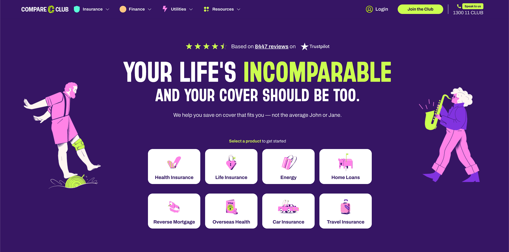
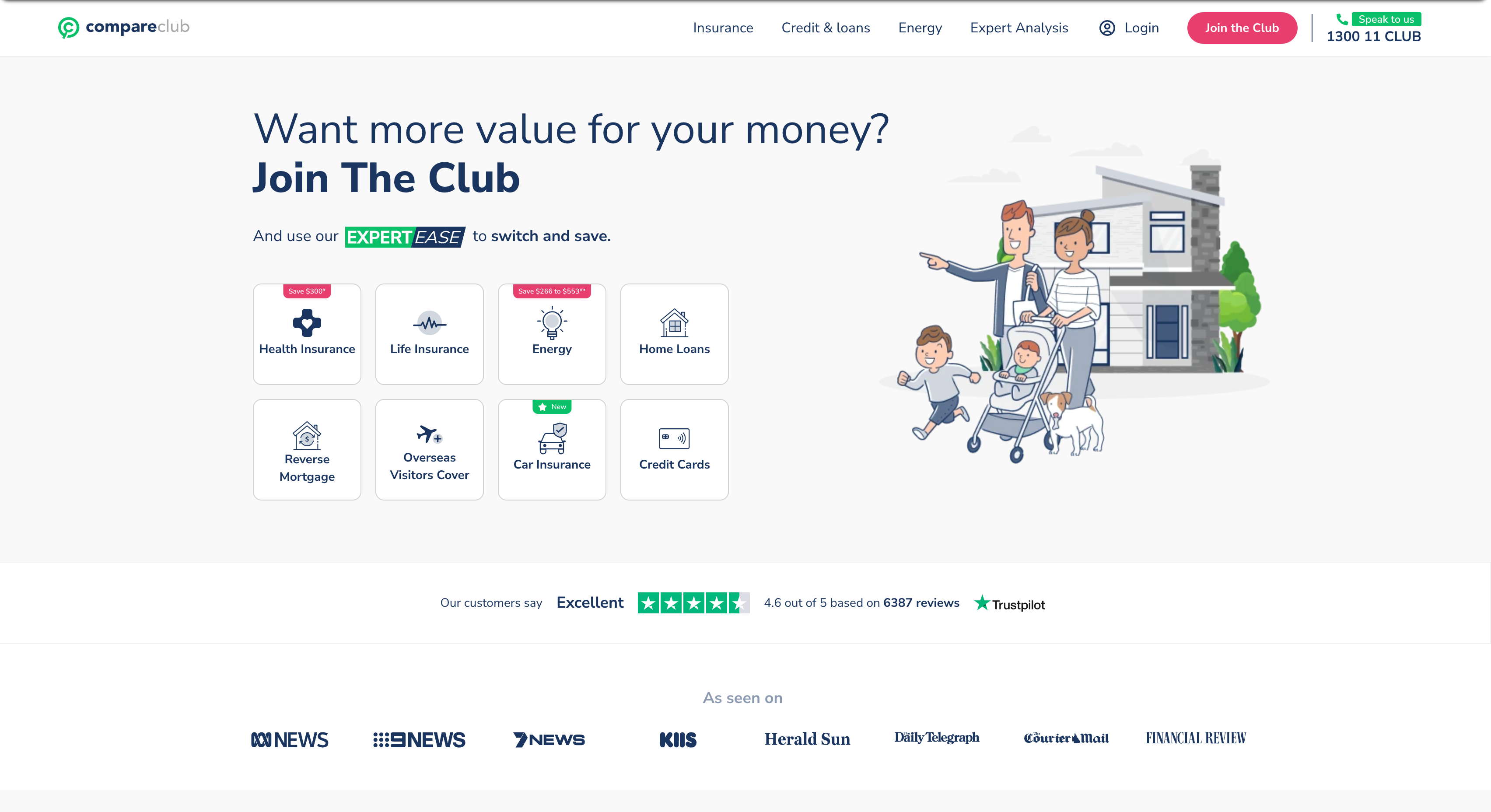
Before & after: Compare Club rebrand
About this project
Compare Club is a financial comparison platform operating across Insurance, Finance, and Utilities, three distinct product verticals with various product teams.
I was contracted to lead the design, build, and implementation of a company-wide design system timed to a major rebrand. The scope was unusually broad: design tokens, component library, Figma governance, and developer handoff, all to be ready for a fixed August 2025 launch.
I was embedded within the product squad, working in 2-week sprints alongside product managers, a frontend engineering team, brand and marketing, and senior leadership who had sign-off authority.
What we were up against
When I started, there were 12 different button styles across the product:
Four heading variations. Colours and spacing hardcoded directly into components rather than managed through tokens.
Each team had solved the same UI problems independently, which meant every new page required renegotiating decisions that should have been settled.
With a rebrand deadline fixed and three product verticals all shipping simultaneously, the fragmentation wasn't just a quality issue. It was a delivery risk. The rebrand would land inconsistently unless everyone was building from the same foundation.
How I worked
The first decision was to audit before designing anything. I catalogued the existing UI estate across all three verticals, mapping every distinct pattern, how frequently it appeared, and where the inconsistency was worst.
Prioritisation matrix
Component inventory across 24 screens and 8 products across 3 verticals
That became the prioritisation matrix: high frequency plus high inconsistency meant fix first. Buttons, inputs, navigation, and cards went into Phase 1. Edge cases, Storybook, and a public documentation site went into Phase 2.
That scope decision was deliberate. "Build it right" versus "ship with the rebrand" is a real tension, and the answer was phased delivery: ship something good enough to hold, then make it robust.
Phase 1 delivered 14 semantic design tokens, 60+ core components each documented with variants, states, props, and QA acceptance criteria, rebrand-critical screens, a shared Figma library, and per-component developer handoff notes.
Shipped 60+ web and mobile components in Storybook alongside engineering. Each component was documented with interaction states, visual behaviour, and acceptance criteria.
Getting engineering on board early was the third critical decision. I ran weekly open component reviews, paired directly with developers on implementation, and used Token Studio for token management so the Figma-to-code handoff was as frictionless as possible. I presented at multiple rounds of stakeholder review, from engineering leads to senior leadership, to maintain alignment on scope, trade-offs, and delivery confidence.
The lesson I'd take back: dev working sessions should have happened in Sprint 1, not Sprint 4. We refactored token names after implementation, entirely avoidable if engineering had shaped the naming conventions from the start.
Colour Tokens
14 semantic tokens defined
Type Scale
1 typeface · 4 weights
Spacing Scale
4pt grid · 6 scale steps
Results & impact
The rebrand launched on schedule across all three product verticals. Release timelines accelerated by 50-60% post-adoption.
Designers stopped duplicating components. One shared Figma library replaced the fragmented estate. Engineering adopted 60+ components with a governance process (propose, review, merge) ensuring ongoing fidelity.
Cross-functional alignment across product, marketing, and engineering was achieved through workshops, documentation, and shared tooling.
Standardised components reduced redundant QA and accelerated A/B test deployment from five days to 48-72 hours.
Established a contribution and governance model and transitioned system ownership to the Head of Customer Experience, ensuring the system stayed maintained after the engagement ended.
All rebrand pages shipped to WCAG 2.1 AA standards.
The deeper takeaway: a design system is less about components and more about changing how a team works. Most of the hard problems weren't Figma problems.