Designing key landing pages for Compare Club's rebrand
Redesigned Compare Club's homepage and 8 product vertical landing pages to reflect a new brand identity, clarify content hierarchy, and sharpen the conversion-focused user journey, within the constraints of an active rebrand and a fixed launch date.
About this project
The homepage and landing pages are where Compare Club wins or loses visitors. They're the first thing a user sees, and the moment they decide whether the product is worth their time.
As part of the broader rebrand, I led research and design across these pages, working closely with product, engineering, and marketing teams. The brief was clear: reflect the new brand identity, make the value proposition immediately legible, and set a reference standard for future page work.
What we were up against
The existing pages had accumulated years of design debt. Messaging was fragmented: sections competed for attention rather than building on each other. Visual hierarchy was inconsistent across verticals. Trust signals (review counts, brand marks, social proof) were buried or absent.
The business needed pages that communicated Compare Club's value clearly, converted better, and held up under the visual demands of a new brand. The underlying challenge was distinguishing structural content problems from cosmetic ones. Only structural fixes would move the metrics that mattered.
How I worked
I led end-to-end design across 8 product vertical landing pages: content structure, messaging hierarchy, layout, and component specification.
The process started before any frames were opened. I mapped what each page needed to communicate, in what order, and for which audience. Content-first wireframes came first, establishing hierarchy before introducing visual treatment.
Hotjar heatmaps and scroll data on the existing pages revealed consistent drop-off well before the primary conversion section on most verticals. Users were disengaging at the point where the page shifted from explaining what the product is to explaining how it works, suggesting the value proposition wasn't landing early enough. That finding directly shaped the content hierarchy decisions on every page.
Each page went through multiple stakeholder review cycles: product for conversion logic, marketing for brand alignment, and senior leadership for overall direction. I worked closely with the Brand team to apply the new identity correctly, and engaged frontend engineers early to align on interactions, responsiveness, and performance constraints.
Components were designed to slot into the emerging design system, so pages and system developed in parallel, each reinforcing the other.
Results & impact
The redesigned pages launched as part of Compare Club's rebrand. Improved hierarchy made the value proposition clearer and reduced the cognitive load on first-time visitors.
Early analytics showed improved scroll depth and engagement on key conversion sections.
Internally, the pages established reference templates for future marketing and product work, a standard others could build from. The work also validated the design system in practice: new pages could be assembled from documented components, with a clear visual language to follow.
All pages shipped to WCAG 2.1 AA standards.
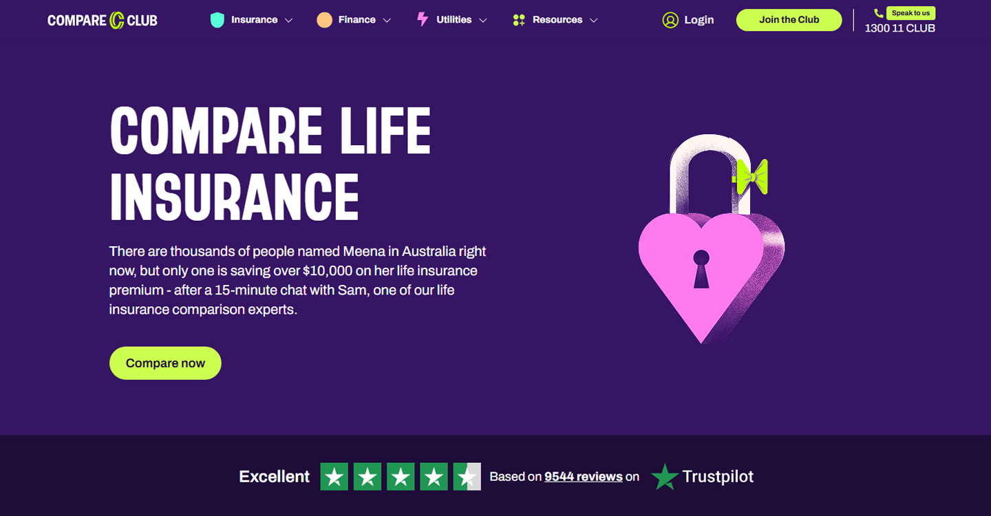
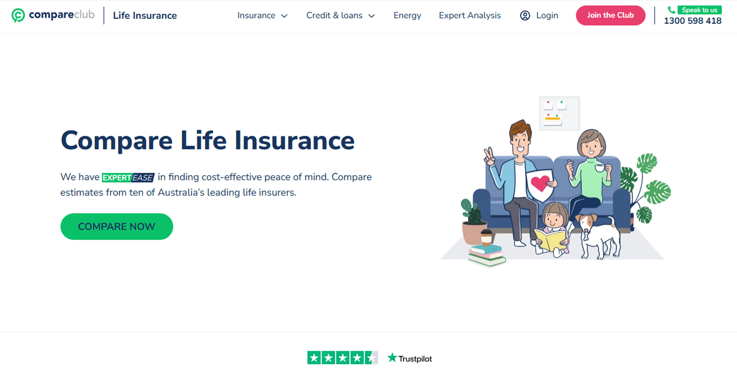
Before & after: Life Insurance landing page