Turning plan selection into plan recommendation
Analytics identified a high drop-off point in ANZ Worldline's pricing plan journey. Reframing the UX question - from "which plan should users choose?" to "what does their business need?" - led to a multi-step recommendation flow and a statistically significant improvement in plan selection retention.
About this project
Payment terminal pricing is not intuitive. ANZ Worldline offers several plans with different fee structures, user limits, and contract terms. Users were abandoning the journey at the plan selection screen - asked to compare options they didn't fully understand, for a product category most of them were new to.
This case study documents the problem diagnosis, the design approach, and the result.
What we were up against
Analytics showed a consistent, high drop-off rate at the pricing plan selection step. Users were reaching the page and leaving - not selecting a plan, not scrolling, just bouncing.
The first hypothesis was a UI problem: too many options, too much information, poor visual hierarchy. But looking at the actual user behaviour, the drop-off wasn't at any specific element on the page. Users were arriving at the plan page already disengaged.
The real problem was what came before it. Users were being asked to make a decision they didn't have the context to make.
How I worked
The redesign started with a hypothesis: if the product already knows enough about a business to recommend the right plan, we should collect that information first - and then recommend, not list.
The new flow is a multi-step wizard:
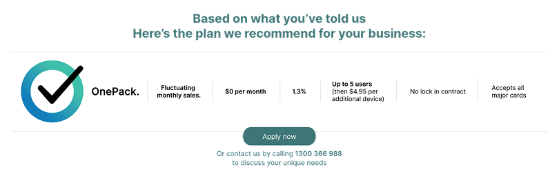
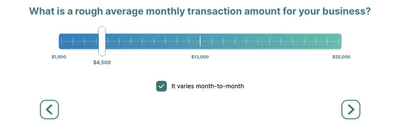
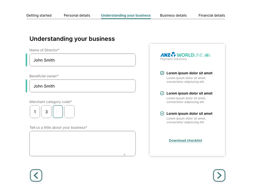
Step 1 collects business type and merchant category. Step 2 asks for average monthly transaction volume via a slider ($1K–$25K, with a "varies month-to-month" option). Step 3 presents a single tailored recommendation: "Based on what you've told us, here's the plan we recommend" - one plan, its key features, and a clear Apply CTA.
The shift: from "choose from these options" to "we've chosen for you based on what you told us." This moved the cognitive load from the user to the product - which is where it should have been.
The redesign was validated through split-user A/B testing before shipping.
Results & impact
Split-user testing showed a statistically significant improvement in plan selection retention.
The result held across business types and transaction volume ranges, suggesting the recommendation framing worked broadly, not just for a specific user segment.
The broader takeaway: this wasn't a UI problem. It was an information architecture problem. The plan page looked fine. The issue was that users arrived there without the context they needed to act. Fixing the page wouldn't have helped; restructuring what came before it did.